
Graffe is an innovative data visualization tool designed to revolutionize how teams interact with and share data. It allows users to query and join datasets from multiple sources without the need for a server and share insights securely within a universal metadata repository. Each visual—whether it’s a table, chart, or dashboard—is rendered with precision, ensuring users can inspect data origins, transformations, and visualization methodologies with complete transparency.
With the technical foundation of Graffe already in place, my primary objective was to lead the design of Graffe’s MVP, creating an intuitive user experience that showcased the tool’s powerful capabilities, while also helping shape the broader product vision.

To set a clear foundation for the project, I conducted a series of in-depth stakeholder interviews with the founder/tech architect, to understand not just the immediate technical requirements, but also the long-term vision for the product. This helped me map out both the functional constraints and the aspirational goals for the MVP.
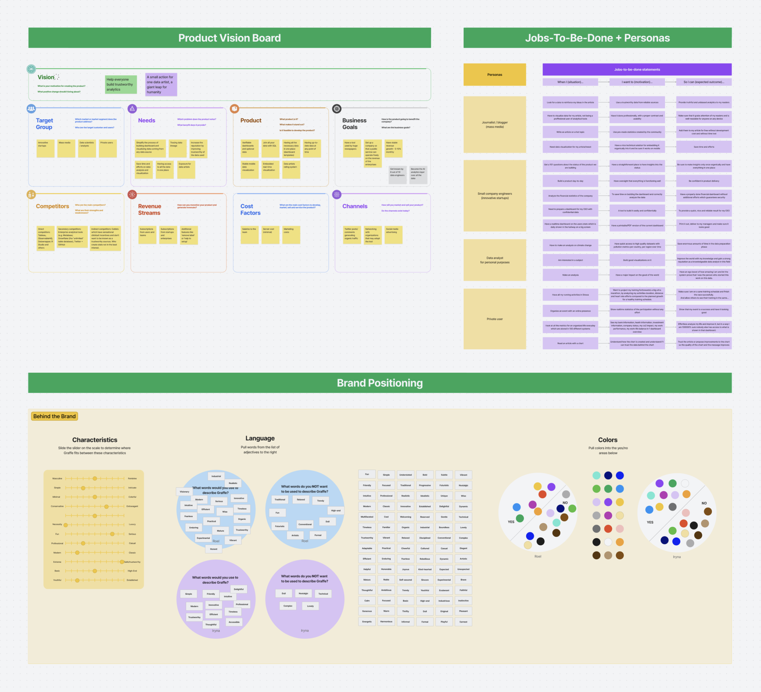
A competitive analysis followed, where I explored existing data tools and adjacent markets, identifying gaps in user experience and opportunities for differentiation. These insights informed the product vision board, which I co-created with the team. The board outlined our product’s mission, target audience, unique value propositions, and high-level features, serving as our strategic compass throughout development.
To ensure a user-centric approach, I organized and conducted a series of user interviews to gather insights into their needs and motivations. The qualitative data served as the foundation for a combined Jobs-to-Be-Done and personas framework. This approach helped link user motivations with product functionality, ensuring we addressed core user needs.
Additionally, I led a brand positioning workshop to define the app’s visual identity, aligning the design direction with the brand’s values and target audience expectations.
During the ideation phase, my focus was on defining both the information architecture and user flows for two core user roles—editors and viewers. I collaborated closely with the tech team to ensure the flows were not only user-centric but also technically feasible within Graffe’s unique framework. We mapped out the entire web app and company website structure, ensuring seamless navigation across both platforms.
Wireframes were developed for each key flow, and usability reviews were conducted early with the team to iterate on and refine these designs. The challenge of working with a front-end-only engine required continuous feedback loops with the tech team, ensuring that the user experience remained fluid despite the technical complexities.
In parallel, I led the development of the app’s visual direction, balancing the need for minimalism in the UI with the flexibility required for complex data visualization. I developed moodboards and UI concepts to guide workshops where we fine-tuned the look and feel of both the app and the website.
Given the technical requirement to use the Tailwind framework, I developed a design system that leveraged its predefined styles—while pushing creative boundaries where necessary. The company website featured a more visually creative direction, while the app UI embraced a clean, functional aesthetic with both light and dark modes.


Once the information architecture, user flows, and wireframes were established, I transitioned into the first iteration of high-fidelity designs. User feedback played a crucial role in our iterative design process, so I organized and conducted multiple rounds of usability testing. The insights gathered directly informed refinements in the user experience. For example, early testing revealed a need for a more intuitive data table creation flow, which led to the redesign of the key flow for creating new data objects.
Working within an agile framework, I collaborated with the tech team to rapidly implement and iterate on the designs. We used lean UX methodologies, allowing for quick feedback loops and adjustments to the product as new features were tested and validated. This approach ensured that we were not just building features, but continuously evolving the product based on real user input.


